 Neodx
Neodx@neodx/svg
Supercharge your icons ⚡️
- TypeScript support out of box - generated types and information about your sprites
- Built-in integration for all major bundlers: Vite, Next.js, Webpack,
rollup,esbuildand another with the power of unplugin - Optional grouping by folders
- Optimization with svgo
- Automatically reset colors
Installation
bash
npm install -D @neodx/svgnpm install -D @neodx/svgbash
yarn add -D @neodx/svgyarn add -D @neodx/svgbash
pnpm add -D @neodx/svgpnpm add -D @neodx/svgGetting started
1. Setup your bundler
First of all, you need to integrate one of our plugins into your bundler and configure it:
For example, Vite configuration will look like this:
typescript
import { defineConfig } from 'vite';
import svg from '@neodx/svg/vite';
import react from '@vitejs/plugin-react';

export default defineConfig({
  plugins: [
    react(),
    svg({
      root: 'assets',
      group: true,
      output: 'public/sprites',
      metadata: 'src/sprite.gen.ts'
    })
  ]
});
import { defineConfig } from 'vite';
import svg from '@neodx/svg/vite';
import react from '@vitejs/plugin-react';
export default defineConfig({
plugins: [
react(),
svg({
root: 'assets',
group: true,
output: 'public/sprites',
metadata: 'src/sprite.gen.ts'
})
]
});Now, sprites will be built at the start of your build/dev command and any changes in the source folder(s) will initiate an incremental rebuild in dev/watch mode.
For example, you will get the following structure:
diff
/
├── assets
│   ├── common
│   │   ├── left.svg
│   │   └── right.svg
│   └── actions
│       └── close.svg
├── public
+   └── sprites
+       ├── common.svg
+       └── actions.svg
└── src
+   └── sprite.gen.ts
/
├── assets
│ ├── common
│ │ ├── left.svg
│ │ └── right.svg
│ └── actions
│ └── close.svg
├── public
+ └── sprites
+ ├── common.svg
+ └── actions.svg
└── src
+ └── sprite.gen.ts2. Create an Icon component
Next, you need to create a single component that will be responsible for rendering icons, visit our "Writing an Icon component" guide for more information.
At the end, you can use your Icon component in any place of your application:
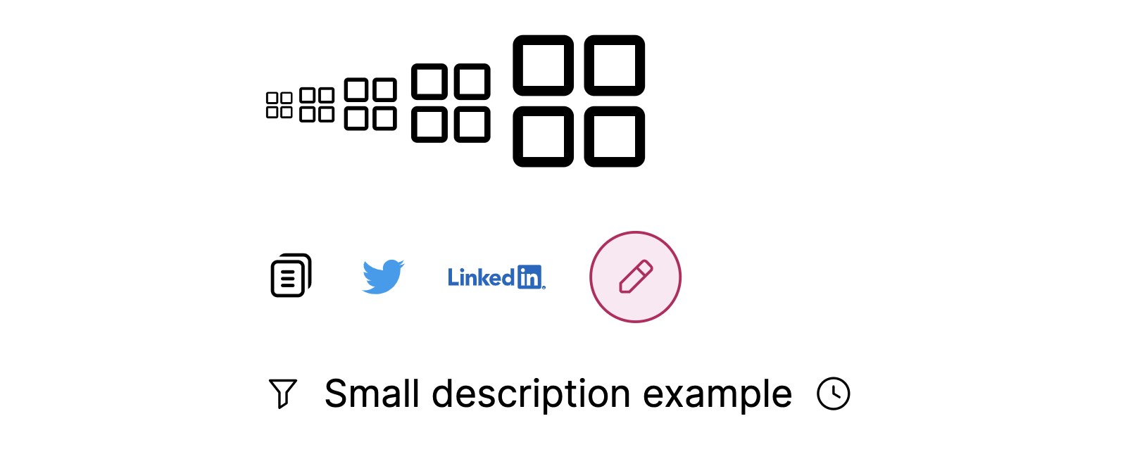
tsx
import { Icon } from './icon';

export function SomeComponent() {
  return (
    <div className="flex flex-col gap-4 text-base">
      <div>
        <Icon name="common/groups" className="text-xs" />
        <Icon name="common/groups" />
        <Icon name="common/groups" className="text-2xl" />
        <Icon name="common/groups" className="text-4xl" />
        <Icon name="common/groups" className="text-6xl" />
      </div>
      <div className="flex gap-4 items-center">
        <Icon name="common/copy" className="text-xl" />
        <Icon name="logos/twitter" />
        <Icon name="logos/linkedin" className="text-4xl" />
        <Icon
          name="common/edit"
          className="bg-pink-100 text-pink-700 p-2 rounded-full border border-pink-700"
        />
      </div>
      <span className="text-sm inline-flex items-center gap-2">
        <Icon name="common/filter" />
        Small description example
        <Icon name="tool/history" />
      </span>
    </div>
  );
}
import { Icon } from './icon';
export function SomeComponent() {
return (
<div className="flex flex-col gap-4 text-base">
<div>
<Icon name="common/groups" className="text-xs" />
<Icon name="common/groups" />
<Icon name="common/groups" className="text-2xl" />
<Icon name="common/groups" className="text-4xl" />
<Icon name="common/groups" className="text-6xl" />
</div>
<div className="flex gap-4 items-center">
<Icon name="common/copy" className="text-xl" />
<Icon name="logos/twitter" />
<Icon name="logos/linkedin" className="text-4xl" />
<Icon
name="common/edit"
className="bg-pink-100 text-pink-700 p-2 rounded-full border border-pink-700"
/>
</div>
<span className="text-sm inline-flex items-center gap-2">
<Icon name="common/filter" />
Small description example
<Icon name="tool/history" />
</span>
</div>
);
}In the result of this funny stuff, you will get something like this:
Enjoy! 🎉